You’d be hard-pressed to come across a business in 2016 that does not have their own website. However, just because a company has a website, does not mean it will be a successful one. With technology moving at the speed of light, and people moving at, well, the speed of life, knowing how and when to give your company website a makeover might not be as intuitive as one may think.
But when is the right time to begin the renovation process? And how do you know your website is due for a tune up?
My best advice: as soon as you have to ask the question, “should I update my website?” is the exact moment when you begin the updating journey.
In an instance, a visitor will decide how they feel about your website and your business. First impressions count. How do you want potential customers to feel when they land on your homepage? In 2016, a clean and quick website is considered the indicator to how the rest of your business will function.
Why should I update my website?
Whether we want to accept it or not, we live in the digital age. Personally, I’ve very recently turned my back on certain businesses (anyone else currently planning a wedding?) simply because their online presence was lackluster at best. I feel that if I cannot trust a business to be Internet savvy in 2016, then I surely cannot rely on them in general. While a slick website may not be the true representation of a company 100% of the time, first impressions are lasting. For many potential customers out there, not being immediately impressed with a company’s website can be a deal breaker.
According to a study completed at Stanford University, 75% of people judge the credibility of a company based on the design of its website alone. Seventy-five percent?! That’s pretty staggering…
How do I know if it’s time to update my website?
I have developed for you, dear reader, a “Do I need to update my website” checklist below. If you answer ‘yes’ to any of the following questions, it’s time to re-think your website design…
Has it been over 3 years since you last updated your site?
If so, this is a good indicator to start seriously considering a refresh.
Is your website in line with your current brand?
Each time your company makes a change, your website should reflect that. No matter how major or minor, neglecting to update your site can turn people away. New phone number? Update it on the site! Revised company vision, mission statement or value proposition? Update! New partners or clients? Update, update, UPDATE!
Is your website intuitive and user-friendly?
How many times have you been attempting to navigate a website to the point of frustration? This is a feeling you never want to impose upon your website visitors. Making your site easy to zip around in is a must. The one thing professionals never have enough of is time. Don’t make your website visitors waste any of theirs on a site that does not flow well.
Is your website responsive?
Again, it’s 2016, most people are conducting business via their smartphones and tablets as they sprint through JFK. It would be a shame to lose a customer before you even had one due to a non-mobile friendly website.
Are you still using Adobe Flash for anything on your site?
- See above (Flash and iPads DO NOT MIX).
- Not convinced yet? Read this: Flash is one step closer to death, thanks to Google.
Do you have your social sharing buttons in a high traffic area?
Make sure the access to your Twitter, LinkedIn and/or Facebook are in a prominent location on your website. Keeping these sharing button icons in your website header, for example, will allow traffic to access your social media platforms from any page in your site!
Are you using social media platforms (Twitter, LinkedIn, Facebook) at all?
If you said, ‘no’ please digress for a moment and read this blog post about social media and business in 2016.
Is your company contact info easy to find?
Well, it should be! You are advertising your fabulous business through your amazing website. PLEASE allow people to be able to reach out to you so they can start purchasing your services. The most successful websites incorporate a ‘Contact’ tab in the main navigation menu of their site.
Is your website URL 10 miles long?
| Your website URL | How it makes me feel |
| www.abc-tech.com | YES, I want to visit your website! It’s easy to remember too! |
| www.allenbillycarsontechnology-servers_monitors?30&sbpage=freetrial_download_professional&sid= 019e4e884b7c18188edbac11302c4102 |
NO, I don’t have time to type all that, and forget copy/paste, I can’t remember your company name now that I am back in my office anyway… Next! |
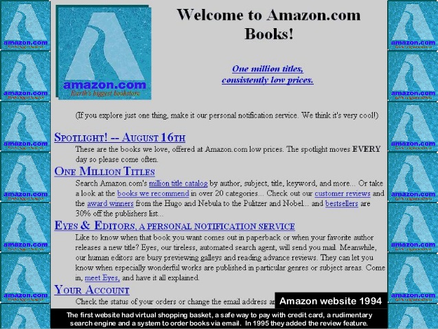
Does your website literally look like it was created in 1994?
Behold, Amazon in 1994 (when they only sold books!):

For the sake of making a point to my dear readers out there, what would you think if
Amazon– AMAZON! still looked like the picture above when you visited their site today, in 2016? I promise you they would not be the largest Internet-based retailer in the United States, had they never bothered to update their website.
Need I say more???
With such easy access to content management systems like WordPress and Squarespace these days, there is really no better time, and no excuse to not update your company website.
—
If you could make suggestions to company websites that you must frequent in your business dealings, what would you have them change to make the user experience better?
What are some great things you have come across on websites that make you think, Hey! That was so easy!


